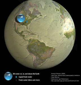
A great graphical representation of how much fresh water we have on Earth.
“This image shows blue spheres representing relative amounts of Earth’s water in comparison to the size of the Earth. Are you surprised that these water spheres look so small? They are only small in relation to the size of the Earth. These images attempt to show three dimensions, so each sphere represents “volume.” They show that in comparison to the volume of the globe, the amount of water on the planet is very small.”
It is hard to imagine the blue sphere represents the sum total of all the freshwater we have available. To farm, cook with, drink, and wash our clothes. I think it shows how fragile our planet is and how every decision we make can affect everyone else.

All the Earth’s Water In A Sphere
You can read more here at USGS.gov.


